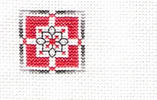
Well, remember a few posts back, I mentioned a red/gray color conversion for Home Love Joy, well, I worked one small part of it in the colors I was thinking of using and I wouldn't mind some criticism, or helpful hints, or thoughts on this, so here it is: my little sample of red/gray Home Love Joy. The only thing is, the reds...they all seem so close in shade that it is hard to tell them apart, there are four shades, and they are (in DMC)
3801-Lightest
666-darker
321 darker than 666
498-darkest
the last one is not pictured here, as this part of the design didn't call for the darkest color. I don't know. please, give me your ideas, or if you have other colors in mind I may use, I need some feedback on this, however, other than the whole "Can't see the difference in red" thing, I am liking this red/gray going on. What do you think?
3 comments:
Have to admit, I can only really see two different colours (reds), but that could be my monitor ... it's hard to get reds with such a big difference in shading without going too pink etc. Regardless, I think it looks great in that colour scheme :)
On my icky monitor, it only looks like one shade of red. So, it would be a bit of a waste to do all of those colour changes and not have them show up LOL.
The reds and grays do look great together, but I think I would try for some more contrast in the reds. Do you have a DMC colour book? They're really helpful when trying to come up with a conversion.
Wish I could be of more help too, but I just can't see much difference, Lana. The color combination is a great one!
Post a Comment